Frequently I look through publications like Denver Metro / Front Range Magazine, Resident News, Savannah Homes… studing real estate advertising.
Consequently, I am absolutely stunned how a lot of Real Estate advertising really misses the mark do to poorly laid out ads and missing information.
Furthermore, I know that quite a lot of these ads are created by big Real Estate Corporation’s “marketing” department, hence, even shocking me more!
Because people are visual, I have performed five ad makeovers using five different style real estate ads.
First of all, let’s review some especially relevant facts relating to Real Estate advertising. Facts that you probably already know.

Especially relevant, is that websites assist 90% of Buyers in their home search!
Therefore, the million dollar question is… why does a lot of Real Estate advertising contain website addresses that are so small while in other ads the website address is nonexistent?
Especially relevant, from a marketing standpoint is the ad’s primary goal most of all, should be to draw people to your website and have them engage on your site for the 10 weeks while they are searching for a home!
KATIE G
Katie Knows Real Estate?
Katie doesn’t have a website, so it seems like Katie DOESN’T know real estate!
- NO WEBSITE! Oh well, that’s not important to 10% of home buyers
- Lots of wasted space
- Overall appearance: Professional
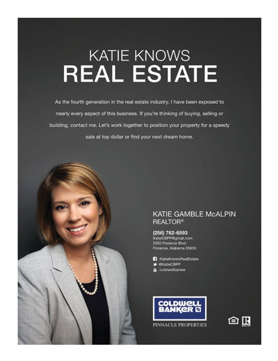
MY MAKEOVER SOLUTION
- Get a website, unless you are targeting the 10% of home buyers that don’t use the Internet
- Finally, prominently display the website address

DAVID H
David’s arms folded = This is one of the top Faux pas in body language! “Arms crossed over your chest signal defensiveness and resistance,”
Forbes Magazine: The ten worst body language mistakes… CLICK HERE
- Bad font choice (unless he is selling rustic cabins in the woods). Too many fonts!
- Poorly laid out
- Overall appearance: Unprofessional
- The photo with David looking up is bad. Why is he lower? Maybe he is he in a basement?

MY MAKEOVER SOLUTION
- New photo, arms NOT crossed. Take photo at eye level rather than David looking up or down.
- New fonts using just 2 styles
- Prominently display the website address above his technology statement and remove
www - Change good to great in his technology statement

JOHN W
John’s arms folded – This is one of the top Faux pas in body language! “Arms crossed over your chest signal defensiveness and resistance,”
Forbes Magazine: The ten worst body language mistakes… CLICK HERE
- John should be branding himself, too much REMAX Town & Country
- Poorly laid out
- Overall appearance: Unprofessional

MY MAKEOVER SOLUTION
- New photo, arms NOT crossed
- Made cell phone number more prominent
- Added red bar to prominently display the website address and removed
www - Given more time I would have removed first REMAX logo
- Not sure if he was playing off “Got Milk”, if so he should drop “A” “Got Realtor”

HALSTEAD
Great eye appeal & verbiage!
- Overall appearance: Very Professional
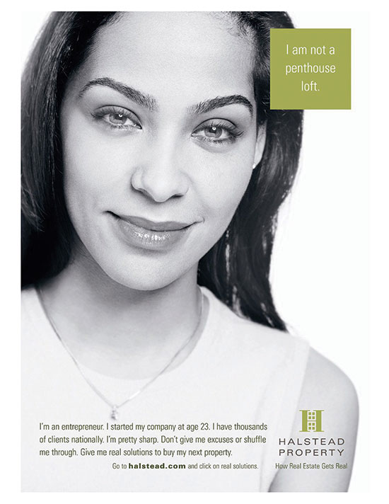
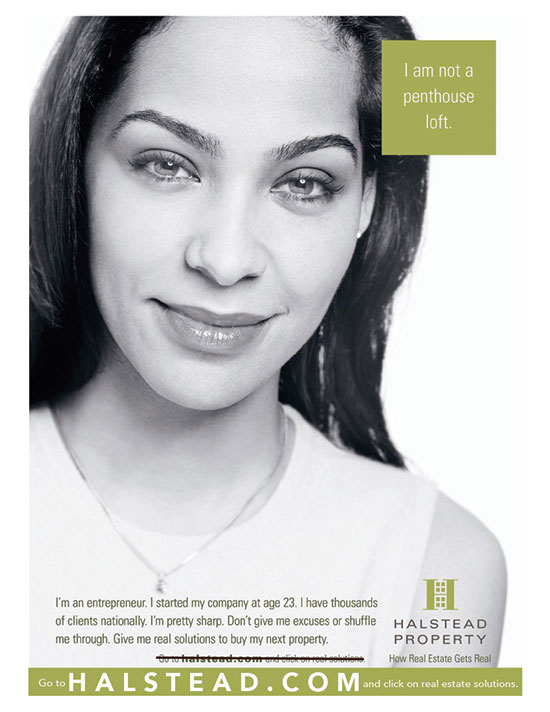
MY MAKEOVER SOLUTION
- Made website address more prominent
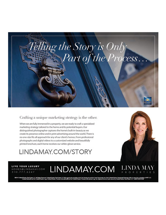
L MAY
Great eye appeal & verbiage!
- Overall appearance: Very Professional
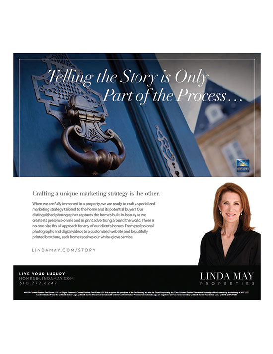
MY MAKEOVER SOLUTION
- Made Story page website address more prominent
- Made her website address more prominent in the footer
BAD AD VS. GOOD AD
In Conclusion, The Difference Could Be Worth Thousands!
Therefore, What is a Great Ad Worth?


